Beauty Contest or an Inevitable Story: A Conversation with Brett Wickens
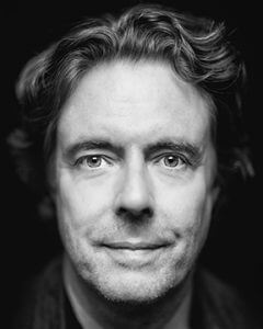
Brett Wickens spent the 1980s helping bring one of the most influential design studios of the era into the digital age — he was the person who moved Peter Saville's studio onto the Macintosh. He went on to become an Associate Partner at Pentagram, VP Creative Director at MetaDesign, partner at Ammunition and Mucho, and has spent thirty years in San Francisco watching the industry change from the inside. He has recently been collaborating with Peter Saville again.
I reached out believing something had been lost in the move to screens and remote work, but unable to say what. Brett named it in the first twenty minutes.
I've been a designer for about fifteen years, almost all of it in corporate, almost all of it digital. And with the home office on top of that — everyone on their own screen, not talking — I started to feel we were losing something. Crucial conversations that never quite rise to the level of a scheduled meeting. During my conversation with Peter Saville, he told me you were the one who moved his studio into digital, and that a year in, you noticed everything had gone onto the screen and nothing was left on paper.
That's true. Officially that was the late eighties, '89 or '90, though I'd come across digital earlier — around '85, on the Whitechapel Art Gallery identity. I needed a classical Roman C that was almost impossible to draw by hand, so a friend with one of the pre-Mac machines and an architect's plotter helped me program and plot it. That was my first brush with technology. It was a tool to solve a problem.
Then it evolved — especially with PostScript. Typesetting used to be an ordeal: you'd write out what you wanted, fax it to a typesetter, and get galleys back the next day. Suddenly you could see the font on screen and control it yourself. A few years later I reviewed the first version of Photoshop, and it gave me the same feeling — now you could do it with images. New Order's Technique cover came straight out of that: trying to capture the 'always on' culture of American Cable News, we found a way to merge two images seamlessly, and the whole album became a series of images blending into one another.
Did the conversations around the work change, with everything suddenly on screen?
Not at first. The important thing was where we got our references — a huge library of art and design and cultural books, magazines, museums, films. A constant trolling of the analogue landscape for what was happening, what might be coming back. Architecture, fashion, art, music all collided, and putting them together through conversation in the studio was how we found ideas. That didn't change initially, because we still needed an idea to go into a project. Digital just meant we could realise it faster. What changed was what the tools became capable of.
You've said the tools introduced a new problem. What was the central one?
The ability to edit. That's the key thing. To become a great designer, or a creative director, you have to learn to edit — not just have ideas, but sort through them. It was John McConnell at Pentagram who put it best, and Peter and I have both used the line ever since: good design is not about what you put in, it's about what you leave out.
The problem with digital tools is that designers can create so much, so many variations, so quickly, that you get lost. And the end result becomes more of a beauty contest than an epiphany. You're trying to pick from twenty things, or fifty, instead of having one guiding light and focusing on it.
Why does the tool make that worse, specifically?
Because everything looks finished. When you sketch in a book, nothing is finished — you look through your sketches and think, that has possibilities. But sketch digitally and it looks done. A lot of designers, especially ones not already predisposed to editing, get fooled into thinking they've finished, because it looks like they've finished. And because they can't edit, they don't know if it's good or bad, whether it has meaning, whether it answers the brief. The finished quality is there from the start. So it isn't really a process anymore.
That's deceiving, in a way. Though I should say — I do a lot of UX work, and there the screen makes sense.
It does. UX is based on principles and patterns, and the medium of consumption is the screen. Designing on screen for screen is right. It's largely functional — you can test whether it works. That's not the same as an album cover. Different requirements.
But when the matter is subjective — an identity, a logo — you don't have a logical principle to fall back on.
And that finished-looking quality is exactly where I think the conversations get lost. Because it feels ready, so people skip the editing phase, or shorten it. And the crucial conversations around the concept get shortened with it.
Which connects to the thing I started with — the conversations disappearing.
If you're working from home, on screen, and your conversations are limited to scheduled Zoom calls, those calls are focused. The agenda gets sent out ahead of time, and that's the conversation. What gets missed are the cultural conversations. What Americans used to call the water-cooler conversation — back when a TV show was broadcast at a set time and everyone talked about it the next morning.
In the studio, somebody would find something in a book and we'd talk about it for half an hour. Someone would bring in a reference that set the tone for the whole day. You'd talk about a film, an exhibition, a shop you found. And the landscape was less cluttered, so finding something interesting felt like a reward. Those conversations acted as a filter — they helped you focus on the thing that had meaning.
Now the landscape is non-linear. You go to YouTube for one thing and it offers you ten more. Same with search, same with AI research — rabbit holes, so easy to fall down. You can get inspired, but there's so much of it that you get excited at too many things to remember any of them. They become a trove of bookmarks. The conversation used to filter that. Without it, you just graze.
How does that show up in the actual work?
I've seen a lot of not-very-good ideas over the years. Some designers still understood the old way — meaning, editing, and I'd argue storytelling was part of that. Sometimes you'd create a design that felt inevitable, where you could make the storytelling connections, so that if you showed it to a client you could tell a story that made it feel like there was nowhere else you could have ended up.
But younger designers often make fifty things, and none of them has that feeling of inevitability. They're just stuff — partly because that's the nature of attention now, partly because the technology lets you make a lot very quickly. It feels like stuff, not like a story.
Explaining creative work has become genuinely hard, especially in corporate settings where stakeholders don't have deep design knowledge. It's a task they want to check off. And "making stuff" plays straight into that.
And let's not forget clients are people too. They're suffering the same attention deficit — everyone feels rushed. There are good clients and not-good clients, and the good ones are the ones who pause, take the time, and listen to expertise. When you sit with a client, you're there because you're doing something they can't. The important thing is having the confidence to take them on a journey.
This is what I mean by beauty contest versus epiphany. I've watched designers present by holding up five logos and asking, what do you think? What do you think? I've never done that. For an identity project there'd be a story — ten slides before you showed any creative work. Not just rehashing brand adjectives, but a journey, so that by the time you showed the work it landed as an epiphany rather than a beauty contest. You're showing them something that feels inevitable. You're not asking what they think — because ultimately you were hired to do something they can't, otherwise they'd do it themselves.
A few weeks ago I was consulting a younger designer who'd shown a client three concepts. I asked her why she felt the need to show three — what the point was. The question had never occurred to her. It was just how design is done: bring several, hope for the best.
To be honest, showing three concepts isn't unusual — and done right, it's a strategy. One-on-one, it's easier to show one and talk through an epiphany. But if you're bringing six people along on a storytelling journey, they'll all interpret things differently.
So you might show three. Often, though, you know one is the right one, and the other two become fodder — a device to help the client understand further that the right one is right. Showing several isn't unusual in the commercial world. But unlike the person you're describing, it's not showing three and hoping. It's showing three because you know which one is right, and the other two help the client arrive there too — as long as you take them on the journey.
Paul Rand is one of my role models in design. That's why I believe in showing one.
It was Paul Rand who famously only ever showed one idea. But look at his sketches — there's an enormous amount of history, learning and work before the one idea. And the one idea was usually right. That's the sense of epiphany, inevitability, confidence. It's hard for younger designers — less experience, so they can't project as much confidence. And so quantity starts substituting for confidence.
Do you think the younger generation relies more on judgment, or on justification? Are they trying to solve the problem, or satisfy the client?
It depends on the designer. Good designers who are honest and gain enough experience are trying to solve the problem. But that means having confidence in your ability to do something novel. It was Paul Rand, I think, who said a great identity is a balance of novelty and familiarity — it has to feel familiar, but be new enough to garner attention and stake out a position in a crowded landscape. There's a David Bowie line too: there's no point being more than fifteen minutes ahead of your time. Go too far and you're just experimental — you're not solving the problem. But you need those fifteen minutes to create the newness.
How does the home-office culture — working alone, locked away — play into all this?
Serendipity disappears. The serendipity of other people's influence, and critical dialogue. In an analogue studio there'd be a point where everyone's work got pinned up on a board and everyone walked around it — critiqued it, discussed it, moved things next to each other. There are digital attempts at that, whiteboard tools, but people contribute at their own pace. It isn't everyone pinning up at once and walking around it together.
So the serendipity of challenge disappears — being challenged and challenging others. When it's digital, the person reviewing it looks at it in isolation, on their own time. And you lose the moment where you might want to kill something, but the designer's intent behind it was actually interesting and it was just the form that didn't work. That intent is something you don't hear about in those environments.
There's another thing I wrestle with — human scale. Designing everything on screen, you lose spatial connection. I used to draw type, scan it, draw on top of it, and in doing that you learned spatial relationships, composition, at human scale — not shrunk down, not flat. And textures and colours that matter in the real world get lost on screen. There are colours you can't replicate — fluorescents. Materiality. You see these fluid identity systems where the logo changes depending on what's happening — looks great as an Instagram post. But what happens on a truck, a building, legal communications? Until we literally have no physical presence and we're all just avatars on screens, spatial relationships matter, and they're being lost.
What would you advise designers coming up now — not even to bring serendipity back, but just to notice it's missing? The reason I'm talking to you is that I only had a feeling something was gone. I couldn't name it, and you just did.
It's tough, because you're talking about a generation that doesn't know the previous way. To achieve any of it you'd need to wrestle people away from screens. There's no denying the convenience — eighty per cent of going to shops has been replaced by an app. You open it, find fifty versions, pick one, and it arrives the next day. That's part of the same speed thing. We now expect everything on demand.
But design is applied art — commercial art — and the art part is getting lost. And the art part is as much mind as it is skill and talent. The mind part is what's being compromised: the connection of mind to form. Knowing what matters, knowing where things have been so you can think about where they might go. The ability to judge — which is just another word for edit — is going, because designers are seeing so much stuff, everything, all the time.
Though there are groups — Universal Everything, field.io and others — who've harnessed technology to create genuinely new forms using generative tools. I've done it myself. There was an identity for a hearing-aid company, maybe ten or twelve years ago, when I was a partner at Ammunition. They were going to be selling direct to customers, and a French designer had invented a novel hearing aid that sat suspended in the ear canal rather than plugging it, so you got natural ambience alongside amplified sound.
Every hearing-aid company that had been in the market for any length of time had an identity based on an audio waveform — you've seen it, the thing you get when you open a music program. So I thought: this is a new hearing aid, what's a futuristic expression of sound? I wanted it diaphanous, with some translucency, because that was the nature of this product. I didn't know how to do it. So I said — what if we have the founder just say the name of the company as a recording, and we use tools that convert audio into 3D imagery?
He recorded the name on his iPhone. I gave a young designer the challenge of researching software that could turn that audio into three-dimensional form. We experimented for a while, because she was learning new software and we didn't quite know what we'd get. And in the end we got something beautiful — it almost looked like a nautilus shell. Diaphanous. An expression of the man saying the name. We could tell the client: you gave us the name, we turned that word into this. And it had all the right qualities — like a shell you hold to your ear to hear the sea, because it circulates ambient sound.
That's how you harness technology. But you have to know what you're looking for. Even when you don't know what it looks like, you need to know what you're looking for. In that case it was a way to represent audio that was fifteen minutes ahead of its time.
And you have to get away from the screen to have the idea in the first place.
A lot of my solutions have come from riding my bike, driving around, just thinking. A couple of weeks ago I bumped into someone with a client looking for an identity — something I wasn't interested in, and I declined. But on the way home I had a crystal-clear idea for it. If you are constantly consuming imagery, you don't have that. It's a bit like the scene in A Clockwork Orange where they tape his eyes open and show him rapid clips. Isn't that TikTok? Massaged by an algorithm to appeal to you, but the same thing — these constant feeds are consuming the time we used to use to think.
And so we don't have time to think anymore. That's the note to end on. What did you make of the conversation?
You've raised a question that needs raising. And I'm not a Luddite — I don't want to throw digital out the window, because there's a reality to how our lives are led. But with that reality comes a responsibility. What has to come back into the picture is the mind. Time to think — and to know what to care about.
The Diagnostic
If this is something that you want to go deeper into, learn more about the Diagnostic. A structured way to map the issue properly.
See how it works→